The brief
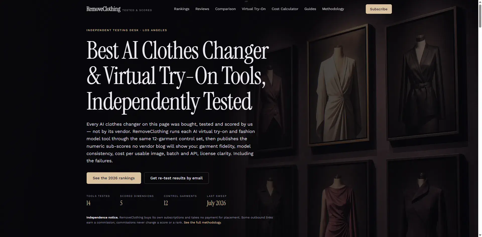
A consumer-facing AI virtual try-on product needed a site that looked as considered as the product itself: dark, atmospheric, image-led, and fast on mobile where nearly all the traffic lands.
What PolyDraft researched
The agent researched how people search for virtual try-on and AI image tools, and how competing consumer AI sites structure their landing pages — where the demo sits, how pricing is framed, what objections the FAQ has to absorb. The keyword plan separated the product term from the how-to and comparison terms so the blog could feed the landing page instead of competing with it.
The pages that shipped
A mobile-first homepage with a full-bleed hero, a feature page, a how-it-works walkthrough, pricing, an FAQ-heavy support page, and blog articles targeting informational demand.
The search layer applied
Structured data, canonical URLs, an XML sitemap, an RSS feed and llms.txt shipped by default. Because the visual layer carries the persuasion on a product like this, the design direction was chosen from PolyDraft's generated options with a cinematic motion tier applied and reduced-motion preferences respected.
Where it runs
Deployed to the owner's own cloud account, with the image library allowing every visual to be swapped in place — the URL never changes, so no page ever needs editing to update artwork.
Verified delivery facts
- Industry
- Consumer AI Product
- Content languages
- English
- Pages shipped
- 10
- Delivery focus
- Image-led dark design with a mobile-first hero and a single dominant conversion path
Evidence basis: our own case record for this build, kept as first-party documentation. These are delivery attributes we can show from that record and have not been independently audited.
Results and metrics
Not publicly disclosed.
What we do not claim
- We have not measured or verified traffic, search ranking, conversion or revenue for these sites, and we make no claim about any of them.
- A case here demonstrates delivery scope — what was researched, written, built and shipped. It is not a performance claim and not a customer endorsement.
- No customer quotes, satisfaction scores, awards or certifications are presented, because we hold none for these builds.
- Where a result is not published, this page says so rather than implying one.
The same process was applied here: see how it works, or the full capability list on the ai website builder for seo page.