Best B2B Websites: 12 Real Examples Scored Against One Buyer Rubric
Best B2B websites, scored: 12 real examples from Stripe and Gusto to Protolabs and Xometry, rated on proof, pricing, buyer paths and mobile, with screenshots.
The best B2B websites let a buyer answer three questions without talking to anyone: what this company sells, whether people like me trust it, and what the next step costs. We captured 12 B2B website examples on 18 and 19 November 2026 and scored them on one rubric. The short version:
- Copy a pricing page from: Gusto, Linear or Stripe. Each shows a real number, and Linear and Stripe mark the point where self-serve ends and sales begins.
- Copy a quote-first hero from: Protolabs or Xometry, where the main button starts a quote and the certifications sit right under it.
- Copy catalog navigation from: McMaster-Carr, which makes search and categories the whole first screen, and Uline, which puts its phone number and Quick Order in the header.
- Copy a buyer split from: Faire and Toptal, which route two kinds of buyer in the first screen, and Gusto, which does it with two tabs on its pricing page.
- Be careful copying: auto-opening chat over a pricing table (HubSpot) and category-label headlines that don't say what you sell (Vercel).
This guide is for teams planning or rebuilding a B2B site with a sales-assisted or self-serve purchase. It is less useful for consumer shops. We make PolyDraft, and after the 12 scored sites we describe two sites built with it. We label both, don't score them, and list their weak spots.
In brief
- We scored each of the 12 sites on six things we could see on the page: value proposition, proof, buyer-path navigation, pricing transparency, demo or contact friction, and the first phone screen.
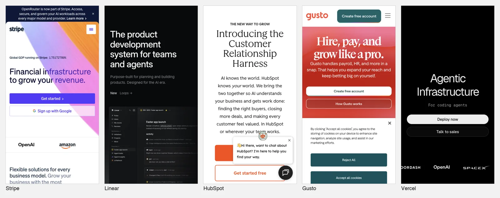
- For the phone score we captured every homepage at a 390 × 844 viewport and asked: are the main button and one proof point in the first screen? Only Stripe and Vercel showed both.
- We ran PageSpeed Insights (mobile) once on every homepage on 19 November 2026. Lab performance scores ranged from 18 (Protolabs) to 89 (Toptal), and six of the 12 passed Google's real-user Core Web Vitals assessment. Lab results move from run to run, so read them as a rough signal, not a ranking.
- The clearest pattern: strong B2B sites name the first step precisely ("Get Instant Quote", "Create free account", "Bring us your challenge") and put one piece of checkable proof next to it.
At a glance: the 14 sites compared
Rows 1 to 12 are the scored third-party sites. Rows 13 and 14 are the two PolyDraft-built sites, which we describe but did not score. "Pricing shown" is what the captured page showed on 18 November 2026 unless a cell says otherwise. "How we evaluated" says how much we actually looked at. Desktop pages were captured on 18 and 19 November, phone screens and PageSpeed Insights runs on 19 November.
| # | Site | Type | Best lesson | Pricing shown (checked 18 Nov 2026 unless noted) | Key weak spot | How we evaluated |
|---|---|---|---|---|---|---|
| 1 | Stripe | Payments platform | Pricing page with one public rate and a clear "Custom" path | Yes: 2.9% + 30¢ per successful domestic card transaction | Failed real-user Core Web Vitals, narrowly (19 Nov) | Public page review, desktop and mobile, PageSpeed |
| 2 | Linear | SaaS | Four tiers, limits written as numbers | Yes: Free $0, Basic $10, Business $16 per user/month billed yearly, Enterprise custom | Desktop hero stayed blank in our captures; no hero button in the part of the phone screen we could see | Public page review, desktop and mobile, PageSpeed |
| 3 | HubSpot | SaaS (CRM, marketing) | Product sidebar on the pricing page | Yes: Free; Starter from $7/mo/seat (promo, listed at $20); Professional from $800/mo | Chat window opened over the pricing table | Public page review, desktop and mobile, PageSpeed |
| 4 | Gusto | SaaS (payroll, HR) | Base fee plus per-person fee on every tier | Yes: from $49/mo + $6/mo per person | Cookie banner covers half the first phone screen | Public page review, desktop and mobile, PageSpeed |
| 5 | Vercel | Developer platform | Proof and demo button in the first screen | Not checked (pricing page not captured) | Headline is a category label | Public page review, desktop and mobile, PageSpeed |
| 6 | McMaster-Carr | Industrial supplier | The catalog is the homepage | Yes, on product pages: $12.42 per pack of 50 for the screw we checked (19 Nov) | No brand message for first-time buyers | Public page review, desktop and mobile, PageSpeed |
| 7 | Protolabs | Manufacturing services | Two quote buttons for two buyer stages | Online quote offered (no list prices; quote not tested) | Customer logos load late; a consent dialog covers the phone hero | Public page review, desktop and mobile, PageSpeed |
| 8 | Uline | Industrial distributor | Phone number and Quick Order in the header | None on the homepage (19 Nov) or the category page we captured | No prices on the two pages we captured | Public page review, desktop and mobile, PageSpeed |
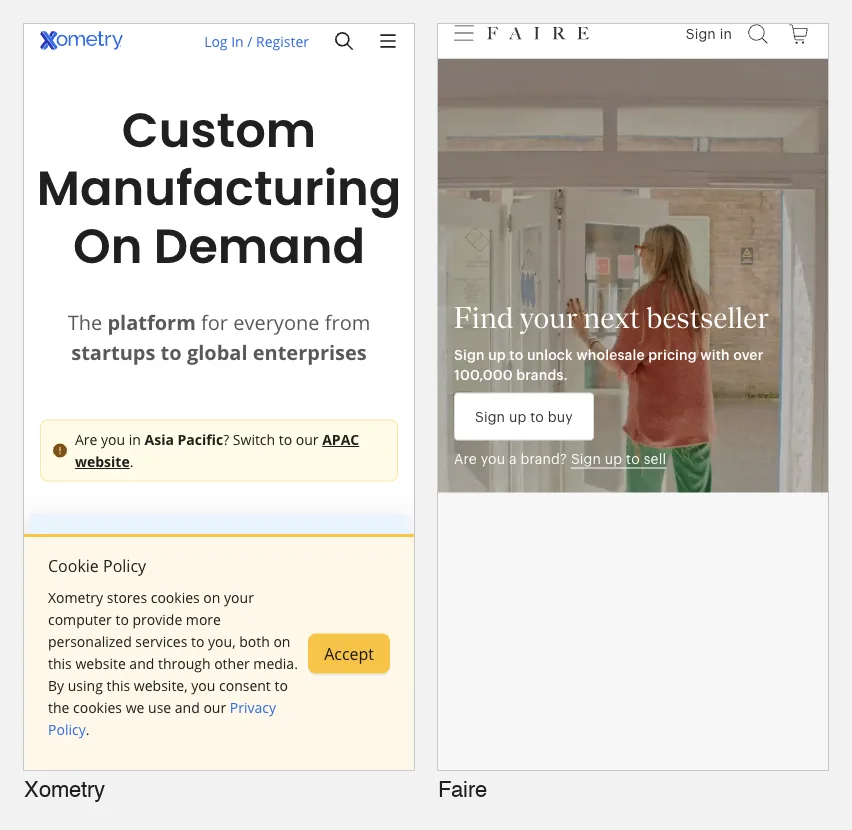
| 9 | Xometry | Manufacturing marketplace | The hero is a CAD upload box | Instant quote offered (no list prices; quote not tested) | Upload box falls below the first phone screen | Public page review, desktop and mobile, PageSpeed |
| 10 | Faire | Wholesale marketplace | Buyer and seller split in one line | No: wholesale pricing needs sign-up | Prices gated behind sign-up | Public page review, desktop and mobile, PageSpeed |
| 11 | Toptal | Talent network | Talent vs consulting toggle above the headline | None on the homepage (pricing page not checked) | No proof in the first phone screen | Public page review, desktop and mobile, PageSpeed |
| 12 | Thoughtworks | Technology consultancy | A concrete paragraph under an abstract headline | None on the homepage (other pages not checked) | Headline doesn't name the service | Public page review, desktop and mobile, PageSpeed |
| 13 | Industrial manufacturer (built with PolyDraft, anonymised) | Export manufacturer | Product and city in the headline | Not checked | Two labels for one quote action | Not re-checked for this article: our case records and earlier article. Not scored |
| 14 | Inspection service (built with PolyDraft, anonymised) | B2B service | "See a sample report" beside "Book an inspection" | Not checked | Certification claim with no verification link | Not re-checked for this article: our case records and earlier article. Not scored |
The rubric below adds a Mobile score, and the speed table lists each homepage's PageSpeed Insights result.
The B2B rubric we used
B2B buyers rarely buy on the first visit, and they usually aren't buying alone. A good B2B page gives each person in that group something to take back: a plain description, proof, a price or a range, and a low-risk next step. We scored six things, each 0 to 2, from what the captured pages showed:
| Criterion | 2 (strong) | 1 (partial) | 0 (weak) |
|---|---|---|---|
| Value proposition | Headline or first sentence names what is sold and to whom | The product is clear only from the paragraph below | Slogan only |
| Proof | Checkable proof near the main action (certifications, named customers, figures) | Proof exists but sits far from the action | None visible in the pages we captured |
| Buyer-path navigation | Distinct paths for distinct buyers or tasks | One generic menu | Hard to find the right page |
| Pricing transparency | A number, or an instant quote, with limits stated | "Starts at" prices with conditions | No pricing and no quote path |
| Demo/contact friction | Self-serve and sales paths both clear, short forms | One path only, or interruptions | Contact hidden or long forms |
| Mobile (390 × 844) | Main button and one proof point in the first phone screen | Main button visible, proof not (or partly covered) | Main button below the first screen or hidden |
Three notes on reading the scores:
- "n/c" means not checked: the page that would show it wasn't captured, or our capture couldn't show it.
- A pricing score of 2 for an instant quote means the page offers one. We didn't submit a quote on any site.
- The mobile score is for the first screen a new visitor sees, banners included. Cookie and consent banners depend on the visitor's location, and ours were shown to a visitor in East Asia, so a visitor elsewhere may see a cleaner first screen. On 10 of the 12 phone captures, a browser extension bar hid the top strip of the page. A button that sits only in that strip would not have been counted.
| Site | Value prop | Proof | Buyer paths | Pricing | Demo/contact | Mobile | Total (of scored) |
|---|---|---|---|---|---|---|---|
| Stripe (home, pricing) | 2 | 2 | 2 | 2 | 2 | 2 | 12/12 |
| Linear (phone home, pricing) | 2 | n/c | 2 | 2 | 2 | n/c | 8/8 |
| HubSpot (home, pricing) | 1 | 0 | 2 | 1 | 1 | 1 | 6/12 |
| Gusto (home, pricing) | 2 | 0 | 2 | 2 | 2 | 1 | 9/12 |
| Vercel (home, sales form) | 1 | 2 | 1 | n/c | 2 | 2 | 8/10 |
| McMaster-Carr (home, product page) | 1 | 0 | 2 | 2 | 2 | 1 | 8/12 |
| Protolabs (home) | 2 | 2 | 2 | 2 | 2 | 1 | 11/12 |
| Uline (home, category page) | 2 | 1 | 2 | n/c | 2 | 1 | 8/10 |
| Xometry (home) | 2 | 2 | 2 | 2 | 1 | 0 | 9/12 |
| Faire (home) | 2 | n/c | 2 | 0 | 1 | 1 | 6/10 |
| Toptal (home) | 2 | 2 | 2 | n/c | 2 | 1 | 9/10 |
| Thoughtworks (home) | 1 | 1 | 2 | n/c | 2 | 1 | 7/10 |
These are our judgements from desktop and phone screenshots, not measurements. A partial score can be the right choice. Faire hides wholesale prices on purpose, for example. Linear's mobile score is n/c because the first phone screen showed no hero button, and the header row that might hold one was hidden by our capture tool. We left the two PolyDraft-built sites out of the scoring because we didn't re-check them.
Mobile speed: PageSpeed Insights, 19 Nov 2026
One mobile run per homepage at pagespeed.web.dev on 19 November 2026 (Lighthouse 13.6.0, emulated Moto G Power on slow 4G). "Lab" numbers come from that single run. "Field" is PageSpeed Insights' Core Web Vitals assessment from the Chrome UX Report: real Chrome users over the previous 28 days (About PageSpeed Insights).
| Site | Lab performance (0–100) | Lab LCP | Lab TBT | Lab CLS | Field Core Web Vitals |
|---|---|---|---|---|---|
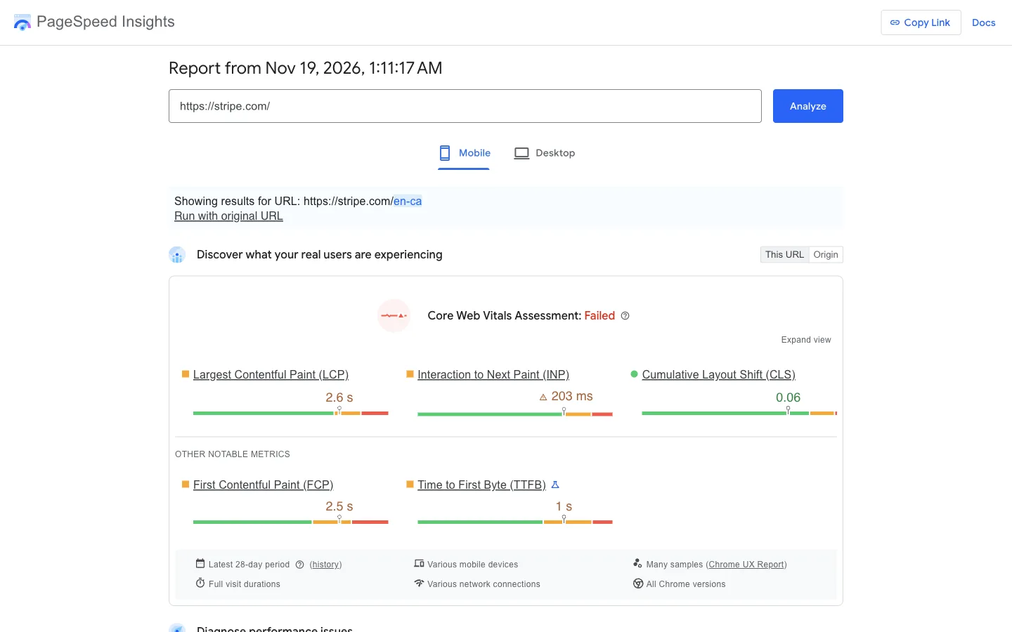
| Stripe | 51 | 5.8 s | 1,050 ms | 0.035 | Failed (LCP 2.6 s, INP 203 ms) |
| Linear | 50 | 17.4 s | 540 ms | 0 | Failed (LCP 4.3 s, INP 216 ms) |
| HubSpot | 59 | 3.5 s | 1,030 ms | 0.073 | Failed (LCP 3.1 s, INP 329 ms) |
| Gusto | 53 | 23.9 s | 510 ms | 0 | Passed |
| Vercel | 80 | 3.3 s | 70 ms | 0 | Passed |
| McMaster-Carr | 84 | 3.2 s | 50 ms | 0.037 | Failed (INP 419 ms) |
| Protolabs | 18 | 11.2 s | 1,360 ms | 0.406 | Failed (CLS 0.15) |
| Uline | 28 | 12.8 s | 2,110 ms | 0.075 | Passed |
| Xometry | 61 | 1.5 s | 4,600 ms | 0 | Passed |
| Faire | 35 | 13.8 s | 2,570 ms | 0.015 | Failed (INP 371 ms) |
| Toptal | 89 | 1.3 s | 410 ms | 0 | Passed |
| Thoughtworks | 53 | 13.4 s | 230 ms | 0.021 | Passed |
Read this table with care. Lab scores move by several points between runs of the same page, and we ran each page once. The lab test simulates a slow phone on a slow connection, so its load times are much longer than most visitors see. The field column is the better guide to real visitors: six of the 12 passed. Gusto shows how far apart the two can be: a 23.9-second lab LCP, yet a pass on real-user data. For your own site, run the test two or three times and compare against your own earlier runs, not against other companies. Every speed line in the entries below comes from this one run.
B2B SaaS and developer platform websites
1. Stripe: a pricing page with one public rate
What it is. Stripe sells payment processing and financial tools to businesses of every size, from startups to large platforms.
Who it suits as a model. Usage-priced products where most customers can self-serve and a minority need negotiated terms.
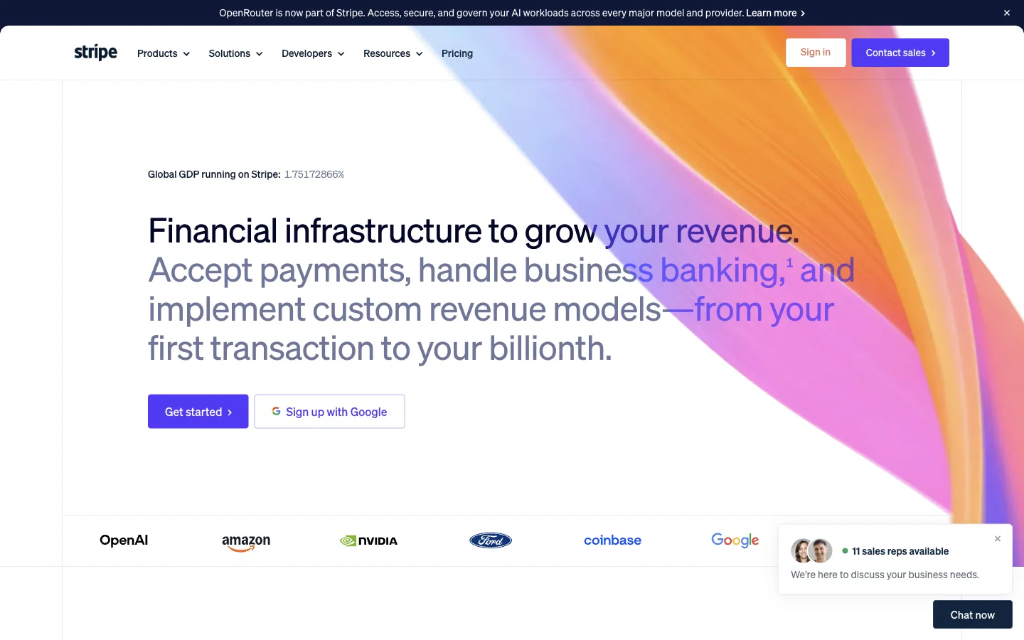
What we saw. The homepage headline says what is sold in plain terms: "Financial infrastructure to grow your revenue", followed by "Accept payments, handle business banking, and implement custom revenue models". Under the two buttons ("Get started" and "Sign up with Google") sits a logo row: OpenAI, Amazon, NVIDIA, Ford, Coinbase and Google. A small widget beside the logos says "11 sales reps available" with a "Chat now" button, so the sales path is offered without covering anything. On a phone, the headline, "Get started" and two of the logos all fit in the first screen.
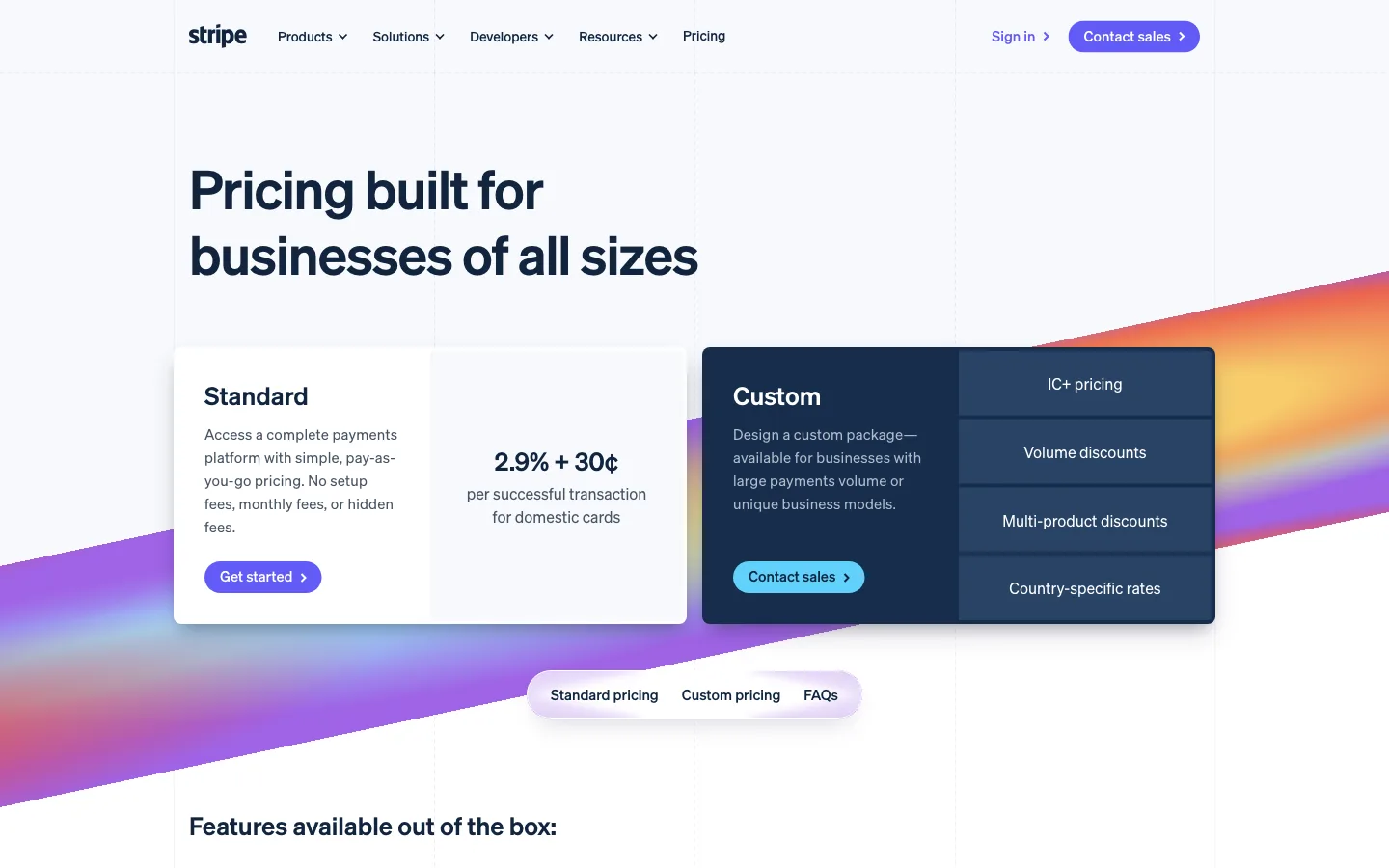
The pricing page opens with two boxes. Standard gives the rate, "2.9% + 30¢ per successful transaction for domestic cards", and the line "No setup fees, monthly fees, or hidden fees", with a "Get started" button. Custom is "available for businesses with large payments volume or unique business models" and lists what you negotiate: IC+ pricing, volume discounts, multi-product discounts and country-specific rates. It uses "Contact sales" (Stripe pricing, checked 18 Nov 2026).
The useful detail is that the Custom box says who should contact sales. A buyer can tell in seconds which path is theirs.
Speed. Lab performance 51, lab LCP 5.8 s, total blocking time 1,050 ms. Real-user Core Web Vitals failed, narrowly, on LCP (2.6 s) and INP (203 ms). The test was redirected to a regional page, stripe.com/en-ca.
Limits. The homepage hero has a large animated background and a live counter ("Global GDP running on Stripe"). We didn't test how much either adds to load time. Stripe's rates differ by country, and the rate above is what the page showed in our session.
Verdict. Copy the two-box structure. Name the public rate, then say in one sentence who qualifies for custom terms.
2. Linear: tiers whose limits are numbers
What it is. Linear is project and issue tracking software for product and engineering teams.
Who it suits as a model. Per-seat SaaS with a free tier and an enterprise tier.
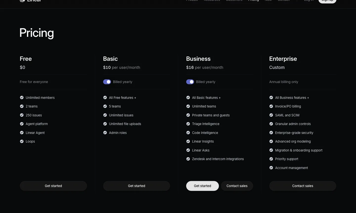
What we saw. Four columns: Free ($0), Basic ($10 per user/month), Business ($16 per user/month), both billed yearly, and Enterprise (custom, "Annual billing only"). The Free limits are numbers, not adjectives: "Unlimited members", "2 teams", "250 issues". Basic raises that to 5 teams and unlimited issues (Linear pricing, checked 18 Nov 2026). Business shows both "Get started" and "Contact sales". That is a sensible place for both, because it is the tier where buying starts to need a conversation.
On a phone. The homepage headline, "The product development system for teams and agents", names the product and the user, followed by a product screenshot. No hero button appears in the part of the first phone screen we could see. The header row was hidden under our browser's extension bar, so we can't say whether its sign-up link was visible, and we left the mobile score as not checked.
Speed. Lab performance 50, lab LCP 17.4 s. Real-user Core Web Vitals failed, on LCP (4.3 s) and INP (216 ms).
Limits. In four desktop attempts on 18 and 19 November, the homepage hero rendered as a blank dark area in our captures (it appears to animate in), so we show the phone capture instead and didn't score homepage proof. The "Billed yearly" toggle means the headline numbers are annual-billing prices. A buyer comparing monthly costs has to flip it.
Verdict. Write plan limits as numbers a buyer can check against their team size. Put a sales button only on the tiers where buyers really need one.
3. HubSpot: a pricing sidebar, interrupted by chat
What it is. HubSpot sells CRM, marketing, sales and service software as separate "Hubs" and bundles.
Who it suits as a model. Multi-product companies whose buyers compare one product at a time.
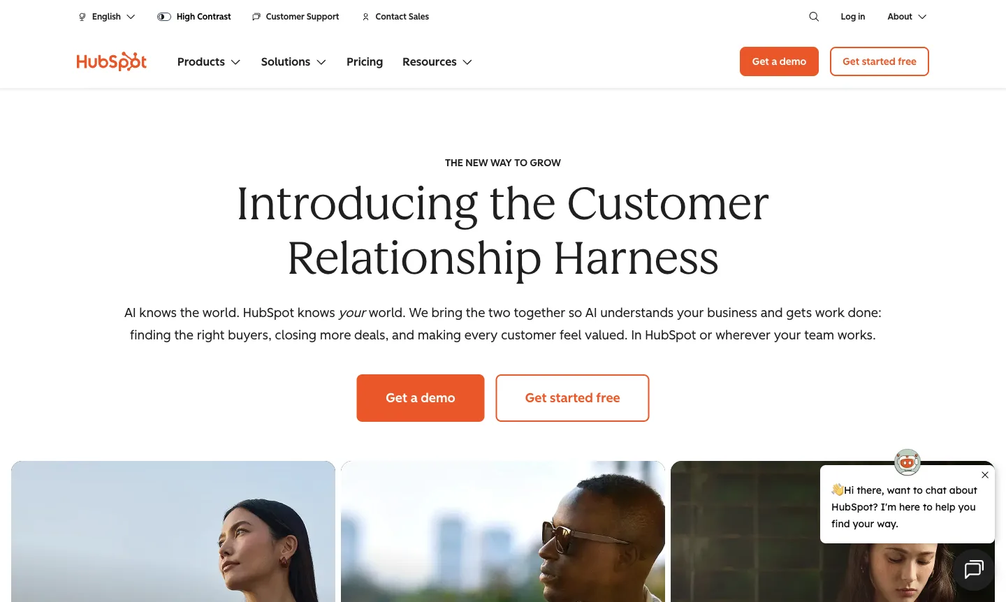
What we saw. The homepage headline, "Introducing the Customer Relationship Harness", is a coined term. The paragraph under it explains it: "AI knows the world. HubSpot knows your world." The two buttons are clear, "Get a demo" and "Get started free", and the top bar has "Customer Support" and "Contact Sales" links. The first screen shows no customer names or figures. A chat pop-up opened in the corner on both desktop and phone.
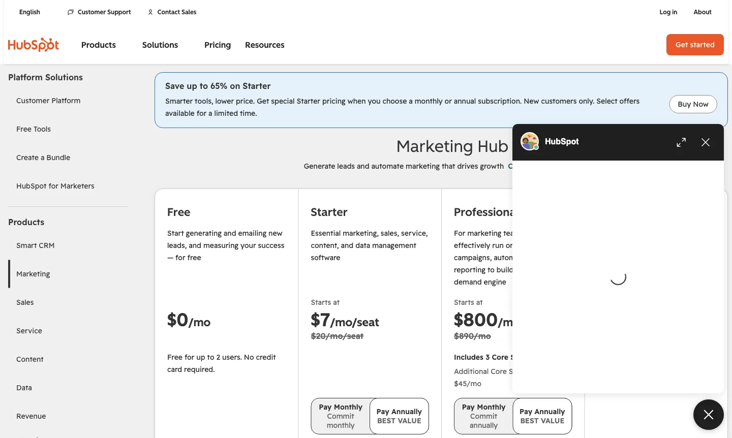
Our request for /pricing redirected to the Marketing Hub pricing page. A left sidebar lists every product (Smart CRM, Marketing, Sales, Service, Content, Data and more), so a buyer can switch products without going back. Prices: Free at $0 "for up to 2 users. No credit card required"; Starter "Starts at $7/mo/seat" with $20 struck through; Professional "Starts at $800/mo" with $890 struck through, including 3 core seats and $45/mo per extra seat. A banner says "Save up to 65% on Starter" for new customers, for a limited time (HubSpot Marketing Hub pricing, checked 18 Nov 2026).
Speed. Lab performance 59, lab LCP 3.5 s, total blocking time 1,030 ms. Real-user Core Web Vitals failed, on LCP (3.1 s) and INP (329 ms).
Limits. In our session a chat window opened over the Professional column shortly after load, so the most expensive tier was partly hidden until we closed it. Chat behaviour can differ by visitor and location. The struck-through prices and "starts at" wording mean the real total depends on seats and billing term.
Verdict. Copy the product sidebar. Don't let chat cover the prices a buyer came to read.
4. Gusto: two buyer types, one price formula
What it is. Gusto sells payroll, benefits and HR software to small and midsize businesses.
Who it suits as a model. SaaS priced per company plus per person, sold to owners who want a number before a call.
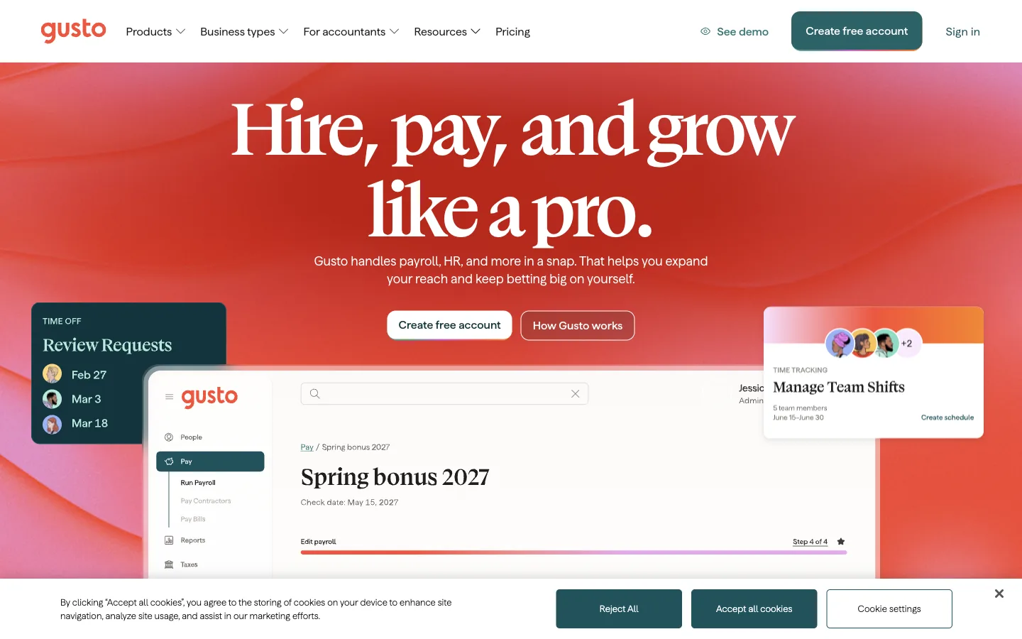
What we saw. The homepage headline is "Hire, pay, and grow like a pro", and the next line names the product: "Gusto handles payroll, HR, and more in a snap." The hero repeats the header's self-serve path ("Create free account") and adds "How Gusto works". There is no customer proof in the first screen, only product interface cards. The cookie banner offers "Reject All" as an equal button, which is easier on the visitor than an accept-only notice.
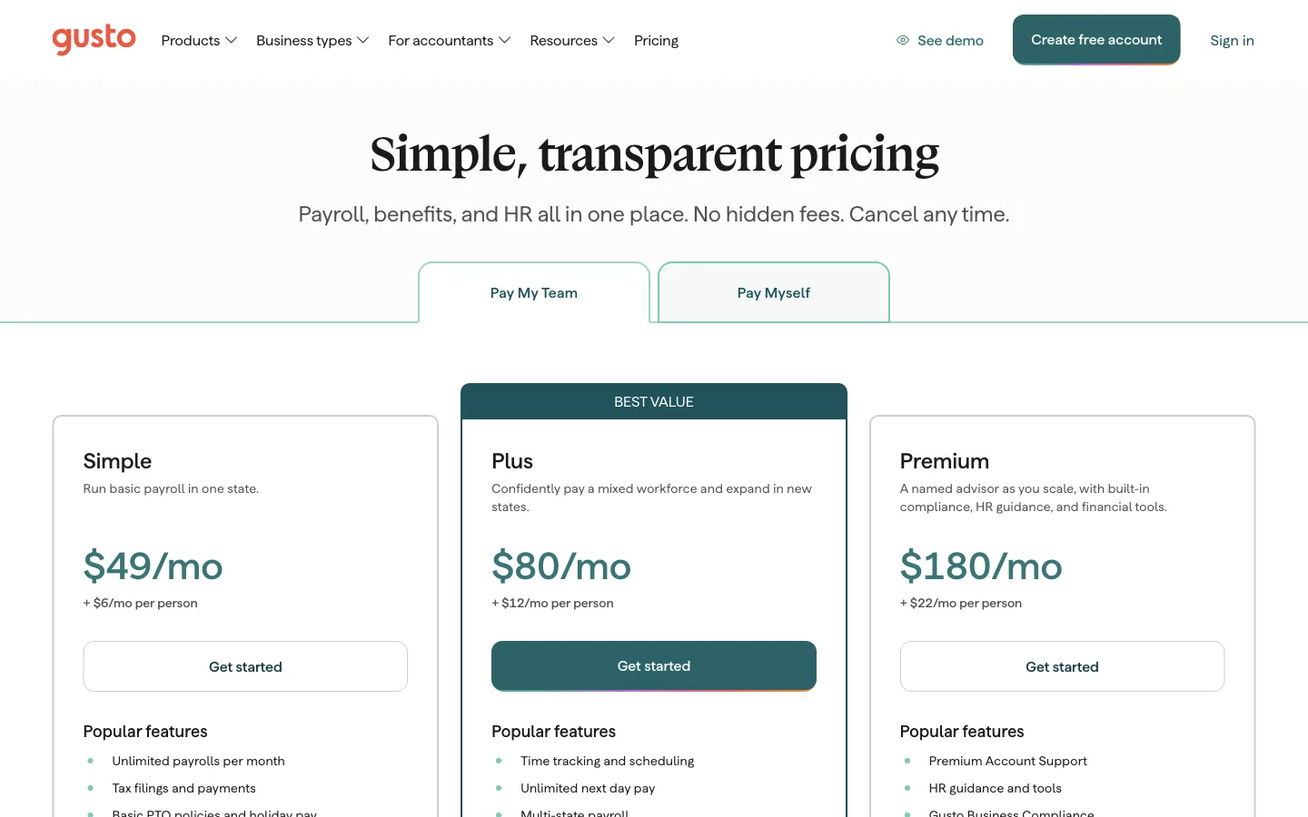
On pricing, the heading promises "Simple, transparent pricing", and the page backs it up. Every tier shows the same formula: Simple $49/mo + $6/mo per person, Plus $80/mo + $12/mo per person (marked "Best value"), Premium $180/mo + $22/mo per person (Gusto pricing, checked 18 Nov 2026). Two tabs, "Pay My Team" and "Pay Myself", split employers from solo owners before any plan detail. The header carries both paths: "See demo" and "Create free account". Each tier also says in one line who it fits ("Run basic payroll in one state").
Speed. Lab performance 53, with a 23.9 s lab LCP, the slowest in the set. Real-user Core Web Vitals passed (LCP 2.2 s), so real visitors typically see a much faster page than the lab run suggests.
Limits. On a phone, the cookie banner covers about half of the first screen until the visitor chooses. Gusto blocked our plain HTTP fetch (403), so the screenshot is our only record of these prices.
Verdict. This is the pricing page to copy if your price has a fixed part and a per-unit part. A buyer can work out their own monthly cost without a calculator.
5. Vercel: proof first, headline second
What it is. Vercel is a cloud platform for deploying web apps and AI applications, sold self-serve and to enterprises.
Who it suits as a model. Developer tools that sell to engineers first and to procurement later.
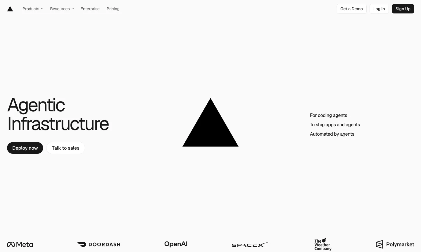
What we saw. The headline is "Agentic Infrastructure", with three short lines beside it: "For coding agents", "To ship apps and agents", "Automated by agents". Two buttons, "Deploy now" and "Talk to sales", match the two buyers. The first screen ends with a logo row: Meta, DoorDash, OpenAI, SpaceX, The Weather Company and Polymarket. The header adds "Get a Demo".
The section worth copying is the sales page.
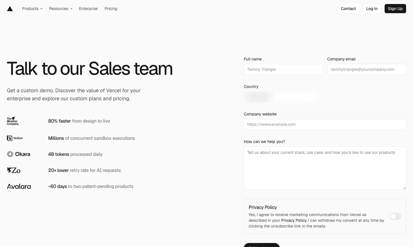
The form asks for five things: full name, company email, country, company website and "How can we help you?". Marketing consent is a separate toggle, off by default. Beside the form, the page lists outcome claims such as "80% faster from design to live" and "4B tokens processed daily" (Vercel contact sales, checked 18 Nov 2026). These are Vercel's own claims; we didn't verify them, and we didn't submit the form.
Speed. Lab performance 80, lab LCP 3.3 s, total blocking time 70 ms. Real-user Core Web Vitals passed.
Limits. "Agentic Infrastructure" names a category, not a job. A first-time visitor who doesn't know Vercel learns what it does from the logos and the menu, not the headline. We didn't capture the pricing page.
Verdict. Copy the short sales form and the opt-in consent toggle. Pair a category headline with a plainer sentence about what the product does.
Industrial and manufacturing company websites
6. McMaster-Carr: the catalog is the homepage
What it is. McMaster-Carr is an industrial supplier selling hardware, tools and materials to maintenance, engineering and purchasing teams.
Who it suits as a model. Distributors whose buyers already know what they need and arrive to find a part.
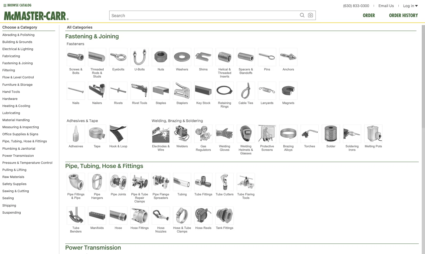
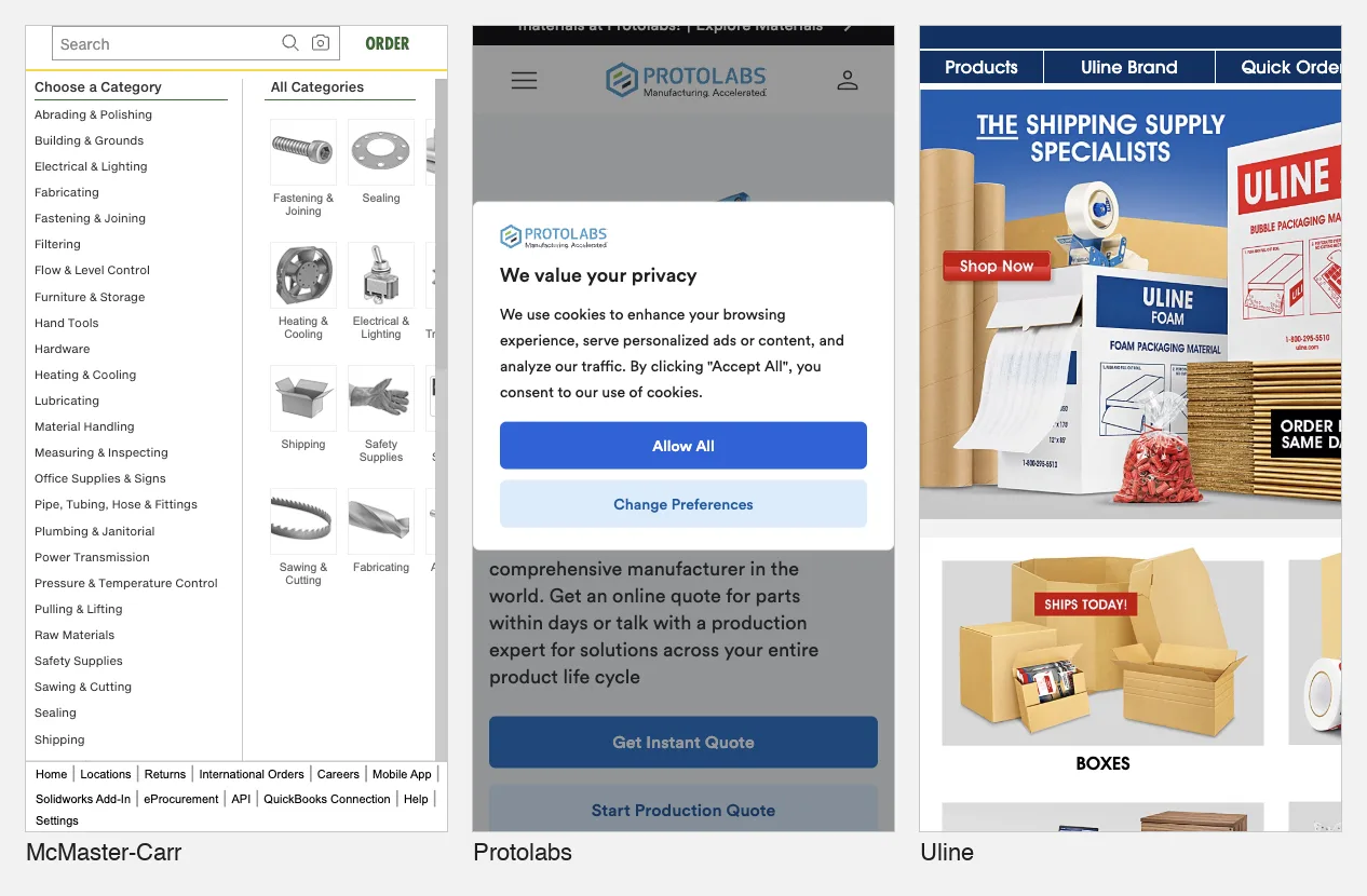
What we saw. There is no hero, no slogan and no photo. The first screen is a search box, a "Choose a Category" list and a grid of small product drawings with labels: screws and bolts, threaded rods, washers, pipe fittings and more. The header shows a phone number, (630) 833-0300, an "Email Us" link and "Order" and "Order History" (McMaster-Carr, checked 18 Nov 2026).
For a repeat buyer this was the shortest route to a product in the set. Their question isn't "who are you?" but "where is the part?". The product page shows how far that goes.
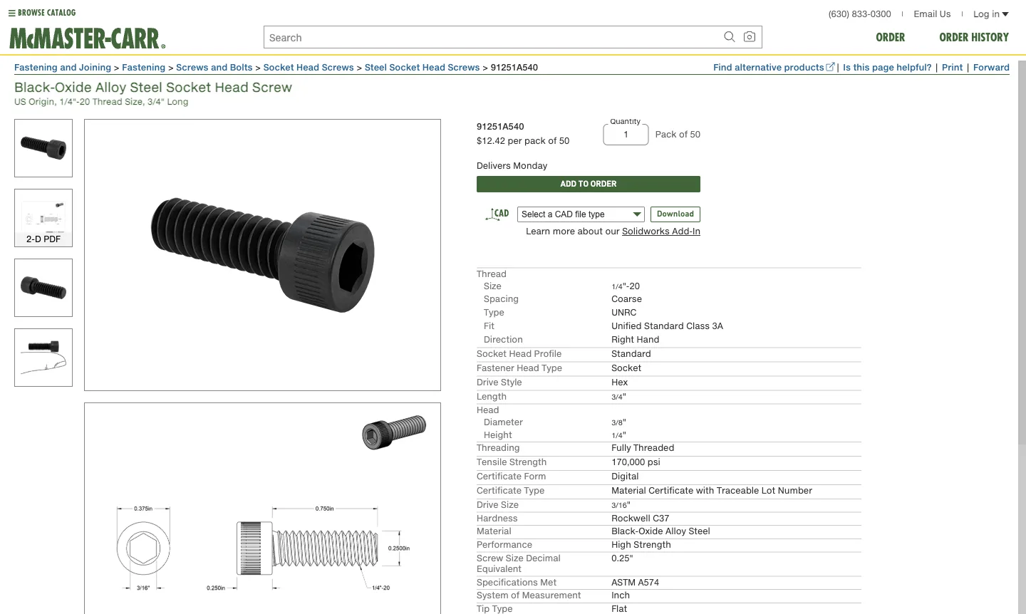
The page for part 91251A540, a black-oxide alloy steel socket head screw, shows the price ("$12.42 per pack of 50"), a quantity box, a delivery day, "Add to Order" and a CAD download with a file-type picker. The specification table runs to tensile strength (170,000 psi), the standard met (ASTM A574) and the certificate type ("Material Certificate with Traceable Lot Number") (McMaster-Carr part 91251A540, checked 19 Nov 2026). An engineer gets everything needed to specify and order in one screen. The delivery day is probably based on the visitor's location.
Speed. Homepage lab performance 84, lab LCP 3.2 s, total blocking time 50 ms. Real-user Core Web Vitals failed on INP (419 ms), which suggests the catalog responds slowly to taps for real visitors even though it loads quickly.
Limits. A first-time buyer gets no statement of what the company is or why to trust it. That works for a supplier with an established customer base, but not for a new entrant. Product pages loaded slowly for us: the first two attempts showed only a loading spinner.
Verdict. If your buyers come back to reorder, make search and categories the first screen and put a phone number in the header. Don't copy the missing value proposition unless your brand is already known.
7. Protolabs: two quote buttons for two buying stages
What it is. Protolabs makes custom parts through CNC machining, injection molding, 3D printing and sheet metal, from prototypes to production.
Who it suits as a model. Manufacturers and job shops that sell both quick one-off jobs and longer production contracts.
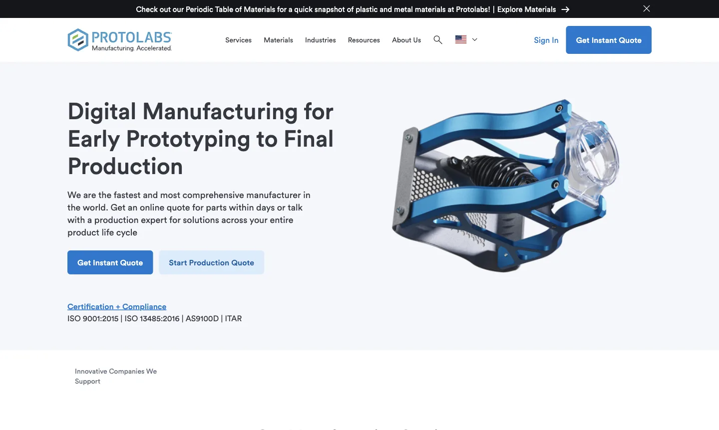
What we saw. The headline names the service and its range: "Digital Manufacturing for Early Prototyping to Final Production". Two buttons split the buyer by stage: "Get Instant Quote" and "Start Production Quote". We didn't click through either, so we can't say what each form asks. Right under them is a "Certification + Compliance" link with "ISO 9001:2015 | ISO 13485:2016 | AS9100D | ITAR" (Protolabs, checked 18 Nov 2026). For a medical or aerospace buyer, that line answers the qualifying question before they scroll.

Speed. Lab performance 18, the lowest in the set, with lab LCP 11.2 s and a layout shift score of 0.406. Real-user Core Web Vitals failed on layout shift (CLS 0.15). The late-loading logo row may be one contributor, but we didn't trace the cause.
Limits. On 18 November, the row labelled "Innovative Companies We Support" was empty when we took the screenshot. On 19 November it showed Blue Origin, John Deere, Medtronic, Polaris and Sonos. A proof row that loads late is proof that some visitors never see. On a phone, a privacy dialog covered the headline on first visit, with the two quote buttons just visible beneath it.
Verdict. This was our highest-scoring industrial site (11/12; only Stripe scored higher). Copy the stage-based pair of buttons and the certifications line directly under them.
8. Uline: the phone number is navigation
What it is. Uline is a distributor of shipping, packaging and warehouse supplies for businesses.
Who it suits as a model. Catalog businesses whose customers order by item number or by phone.
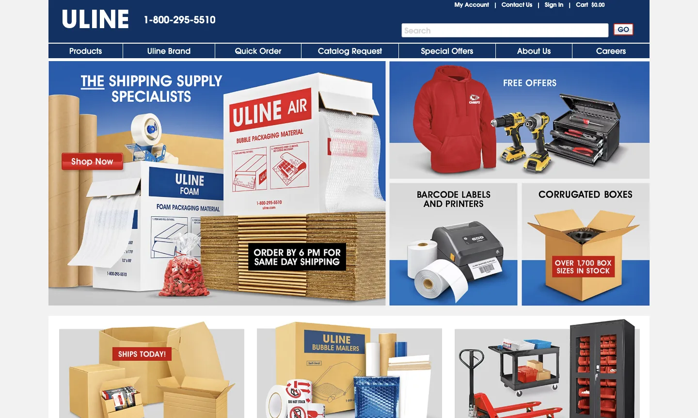
What we saw. The homepage leads with "The Shipping Supply Specialists" and two concrete service promises: "Order by 6 PM for same day shipping" and "Over 1,700 box sizes in stock" (Uline, checked 19 Nov 2026). These are Uline's own claims.
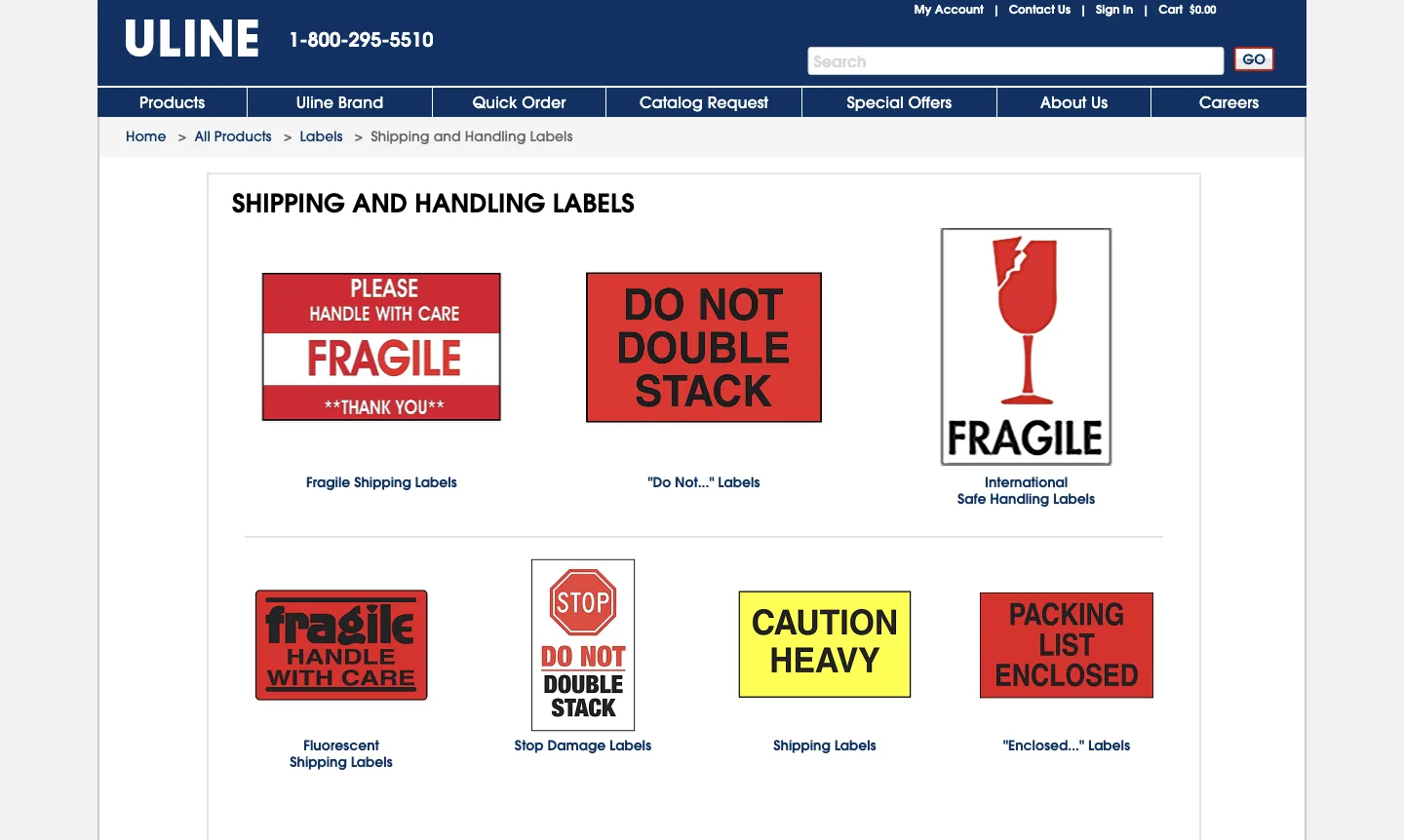
On the category page, the phone number, 1-800-295-5510, sits next to the logo, with about the same visual weight as the brand. The main bar includes "Quick Order" and "Catalog Request", two tasks that belong to repeat business buyers. A breadcrumb (Home > All Products > Labels > Shipping and Handling Labels) and thumbnails that show the actual product make the category easy to scan (Uline, checked 18 Nov 2026).
Speed. Lab performance 28, lab LCP 12.8 s, total blocking time 2,110 ms. Real-user Core Web Vitals passed (LCP 2 s).
Limits. Neither the homepage nor the category page shows prices, so pricing isn't scored. The boxes URL we requested sent us to a labels category. We can't confirm that URL was ever a live page, so we don't count the redirect against the site.
Verdict. Put the tasks your repeat buyers do (quick order, reorder, request a catalog) in the main navigation, not in the footer.
B2B marketplace websites
9. Xometry: the hero is the product
What it is. Xometry is a marketplace that quotes and sources custom manufactured parts from a network of suppliers.
Who it suits as a model. Two-sided platforms and any business whose first step can be done online.
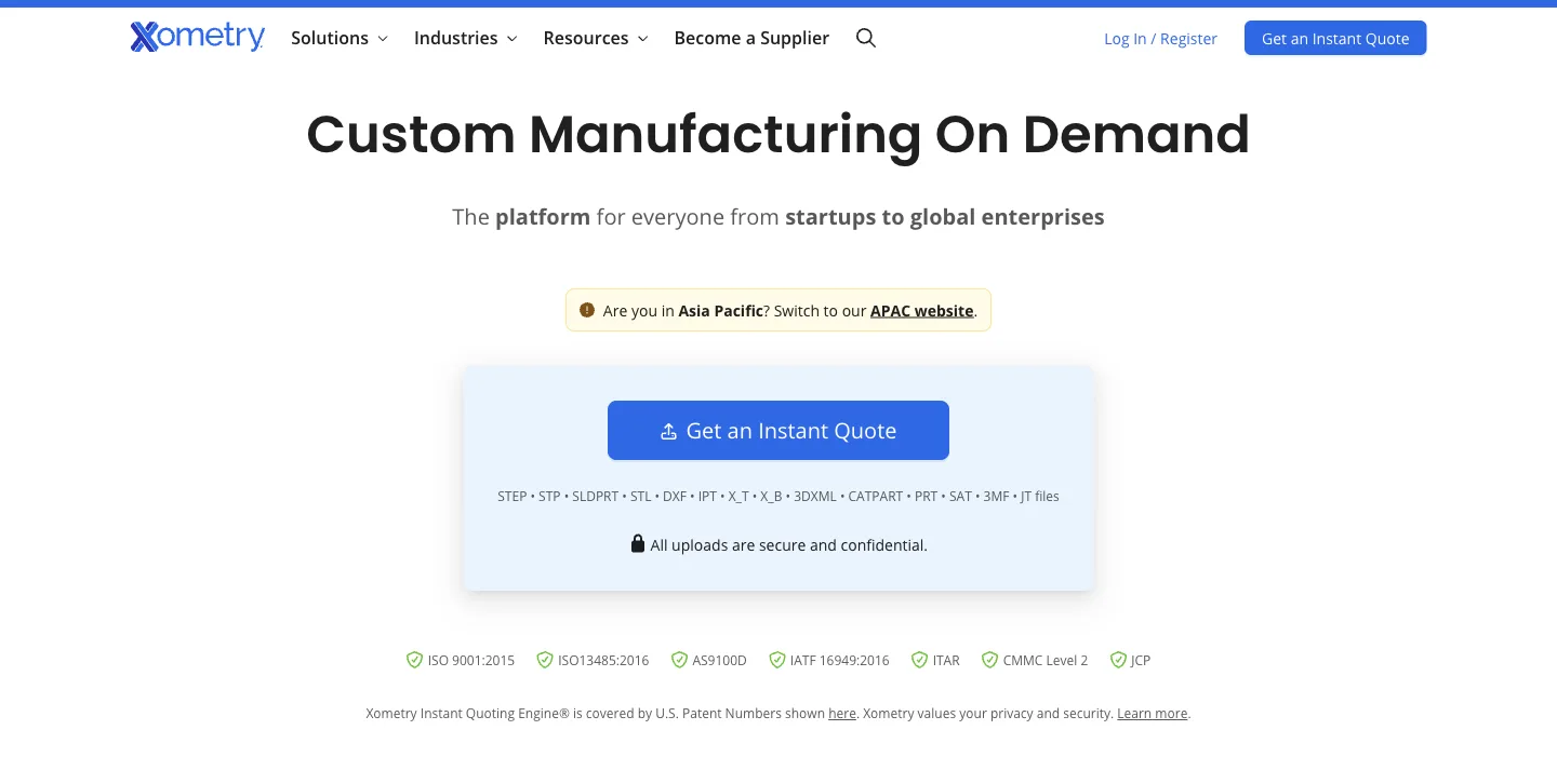
What we saw. "Custom Manufacturing On Demand", then "The platform for everyone from startups to global enterprises". The main element is a box with "Get an Instant Quote", the CAD formats it accepts (STEP, STP, SLDPRT, STL and more) and "All uploads are secure and confidential". That answers an engineer's IP worry at the moment they're about to upload. A certifications row follows: ISO 9001:2015, ISO 13485:2016, AS9100D, IATF 16949:2016, ITAR, CMMC Level 2 and JCP (Xometry, checked 18 Nov 2026). "Become a Supplier" sits in the main menu for the other side of the marketplace. The page HTML also lists figures such as 90,000 buyers and 5,000 suppliers further down; these are Xometry's own claims.
Further down, the homepage turns the services into tabs.
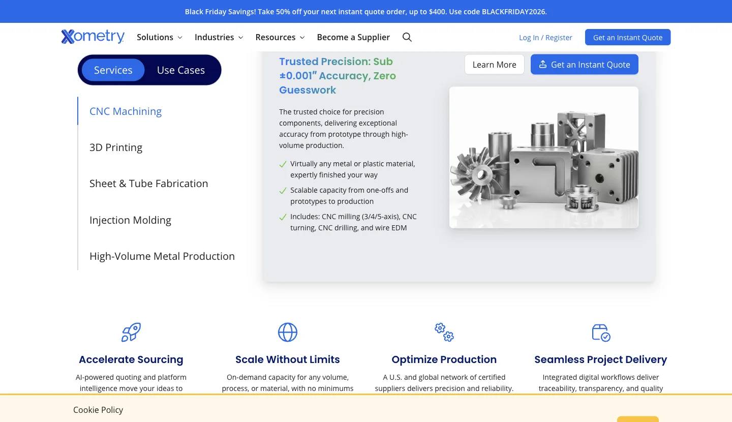
Each service tab has its own "Get an Instant Quote" button, so the quote path follows the buyer down the page instead of living only in the hero. A banner at the top advertised a Black Friday discount on the next instant quote order.
Speed. Lab performance 61. The lab LCP was fast (1.5 s), but total blocking time was 4,600 ms, the highest in the set, meaning scripts kept the page busy after it appeared. Real-user Core Web Vitals passed.
Limits. The cookie notice offered only "Accept", and the page showed a prompt to switch to the APAC site based on our location. Both sit between a new visitor and the upload box. On a phone, the upload box falls below the first screen, so the hero's main action isn't visible until the visitor scrolls. We didn't upload a file, so the quote itself is untested.
Verdict. If your first step can happen online, make it the hero. List the accepted file types and answer the confidentiality question in the same box. Then check that the box still appears in the first phone screen.
10. Faire: one line for each side
What it is. Faire is a wholesale marketplace connecting independent retailers with brands.
Who it suits as a model. Marketplaces that must recruit buyers and sellers from the same homepage.
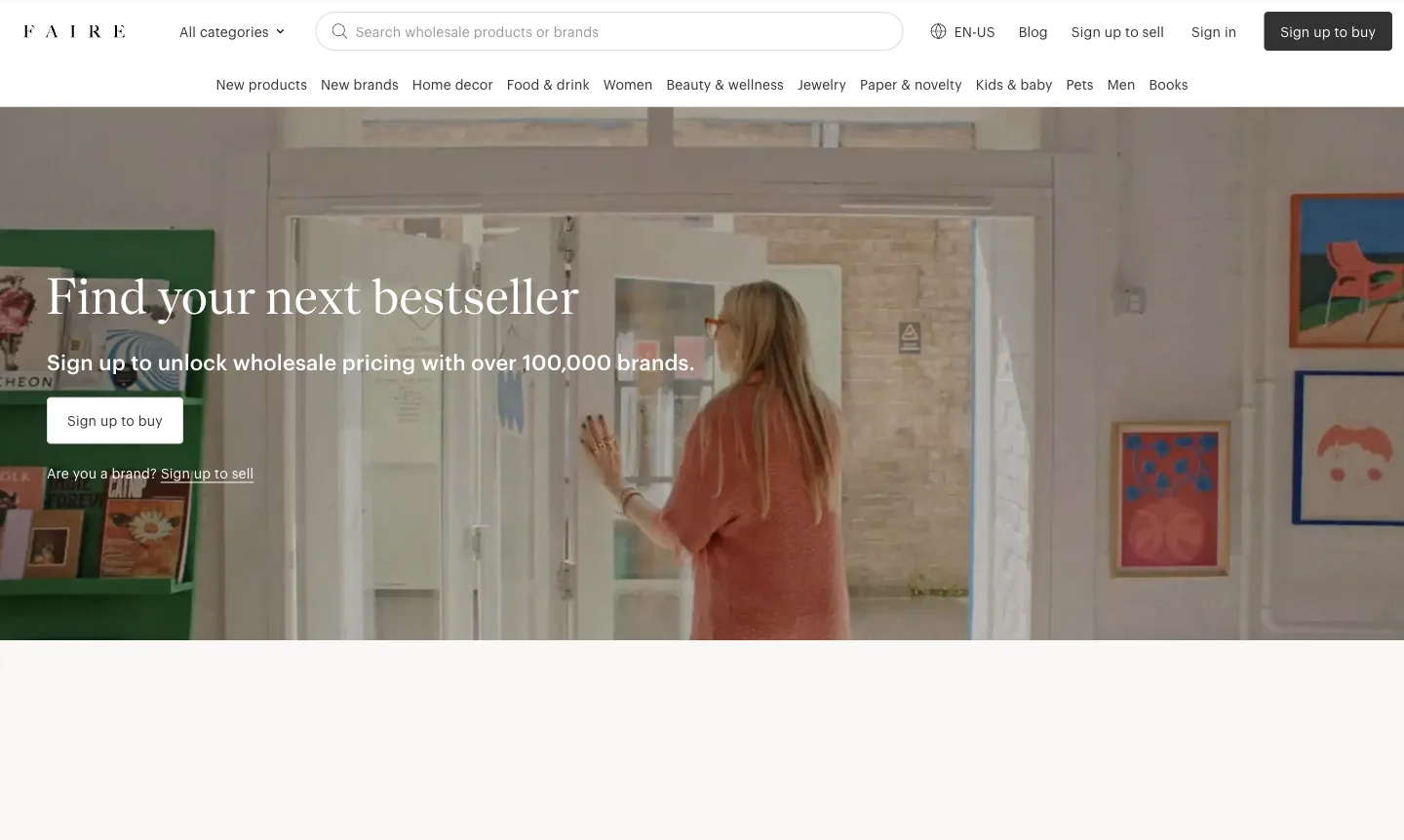
What we saw. The hero speaks to retailers: "Find your next bestseller", then "Sign up to unlock wholesale pricing with over 100,000 brands", then "Sign up to buy". One line below, in smaller text: "Are you a brand? Sign up to sell". The header search says "Search wholesale products or brands", which suggests a retailer can browse before signing up; we didn't test that (Faire, checked 18 Nov 2026). The page also promises "free returns on every first order with a brand", a risk reducer aimed at a retailer's first purchase. The brand count and the returns promise are Faire's own claims.
On a phone. Both paths survive: "Sign up to buy" and "Are you a brand? Sign up to sell" fit in the first screen.
Speed. Lab performance 35, lab LCP 13.8 s, total blocking time 2,570 ms. Real-user Core Web Vitals failed, on INP (371 ms).
Limits. Our three attempts to capture the section below the hero returned blank areas, because that content hadn't loaded in our captures, so we didn't score proof. Wholesale prices are gated behind sign-up. That suits a marketplace that needs to verify retailers, but a buyer can't judge margin before handing over details. We scored it 0 on pricing for that reason, while recognising it's deliberate.
Verdict. Copy the main path plus one small line for the second audience. It keeps the hero focused without losing the other side.
Services and consultancy websites
11. Toptal: choose your path before the headline
What it is. Toptal is a network of freelance developers, designers, finance experts and consultants, plus a consulting and services arm.
Who it suits as a model. Service firms that sell both individual experts and managed projects.
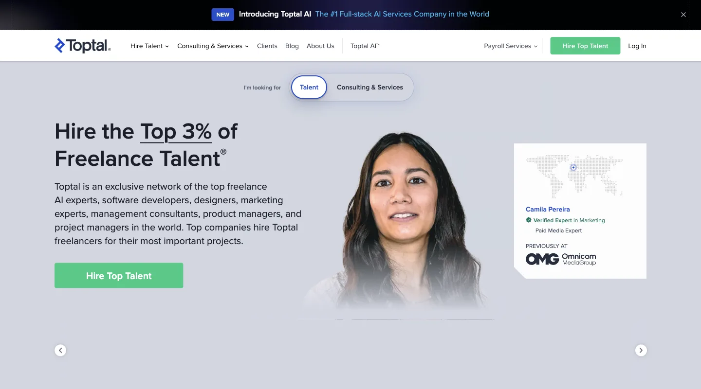
What we saw. Above the headline sits a toggle: "I'm looking for" Talent or Consulting & Services. The buyer picks a path before reading the pitch. The headline, "Hire the Top 3% of Freelance Talent", is a specific, if unverifiable, selectivity claim. The button repeats the job: "Hire Top Talent". Proof is a profile card for one expert, with a "Verified Expert" badge and a former employer (Toptal, checked 18 Nov 2026).
Just below the hero, the proof gets broader.
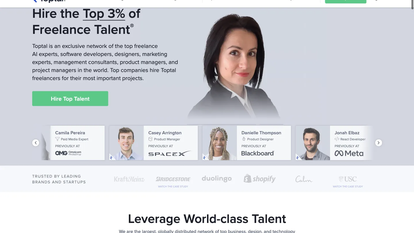
A row of expert cards lists each person's role and a previous employer, and a "Trusted by leading brands and startups" row follows, with Kraft Heinz, Bridgestone, Duolingo, Shopify, Calm and USC. Two of the logos carry a "Watch the case study" link, which turns a logo into something a buyer can check.
Speed. Lab performance 89, the highest in the set, with lab LCP 1.3 s. Real-user Core Web Vitals passed.
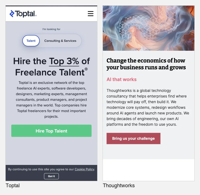
Limits. On a phone, the first screen shows the toggle, headline and button but no proof. Rates aren't on the homepage, and our plain HTTP fetch was blocked (403), so we didn't check a pricing page.
Verdict. If you sell two service models, a toggle above the headline is cleaner than two competing buttons.
12. Thoughtworks: an abstract headline rescued by a concrete paragraph
What it is. Thoughtworks is a global technology consultancy that modernizes systems, builds products and runs AI programs for enterprises.
Who it suits as a model. Consultancies and agencies selling large custom engagements with no price on the homepage.
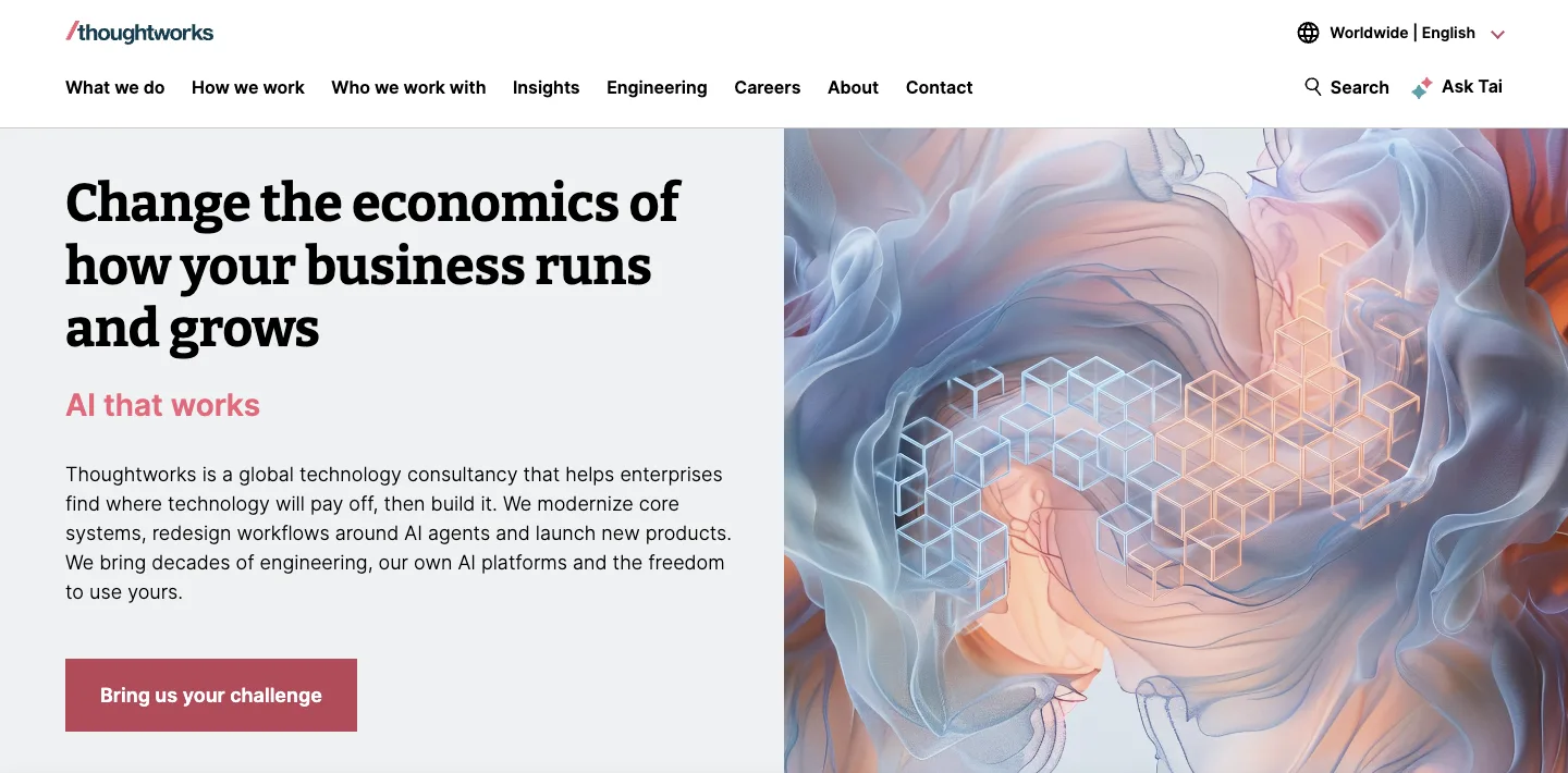
What we saw. The headline, "Change the economics of how your business runs and grows", could belong to any firm. The paragraph under it does the work: "Thoughtworks is a global technology consultancy that helps enterprises find where technology will pay off, then build it. We modernize core systems, redesign workflows around AI agents and launch new products." The one button, "Bring us your challenge", is a better label than "Contact us" because it tells a buyer what to bring. The menu includes "Who we work with" for buyers who first want to see clients like themselves (Thoughtworks, checked 18 Nov 2026).
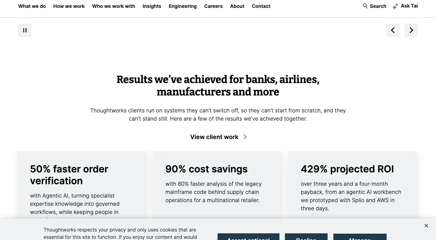
Further down, a section titled "Results we've achieved for banks, airlines, manufacturers and more" shows three cards: "50% faster order verification", "90% cost savings" and "429% projected ROI", each with a sentence on how it was achieved, plus "View client work". The cards don't name the clients, and the figures are the firm's own.
Speed. Lab performance 53, lab LCP 13.4 s. Real-user Core Web Vitals passed.
Limits. No proof appears in the first screen on desktop or phone. A consultancy with this many clients could move one of those result cards up beside the button.
Verdict. If your headline must stay broad, make the next sentence say exactly what you do and for whom, and give the contact button a job-shaped label.
Two sites built with PolyDraft (disclosed)
We make PolyDraft, and these two client sites were built with it. As in our annotated business website examples, we describe them by type and don't name them here. We didn't re-open them for this article. The descriptions come from that earlier article, which was written from homepage captures in our case records on 13 November 2026. Those records haven't been independently audited, and we make no claim about their traffic, rankings or sales. Redacted screenshots of both homepages are in that article. We don't repeat them here, and we didn't run phone or speed checks on them, because publishing per-site measurements next to a description makes an anonymised site easier to identify. For the same reasons, neither site is scored.
13. An export manufacturer of machine components
The headline names the product and the home city, and a thin top bar shows a phone number, email and WhatsApp link for buyers in other time zones. The menu follows how engineers shop: Products and Services drop-downs, plus Applications and Download for specification material. Product pages carry specification tables. Weak spot: the header says "Get a Quote" and the hero says "Get a Free Quote" for what appears to be the same form. Lesson: for an export manufacturer, the place and the part number matter more than the brand story.
14. A quality-inspection and factory-audit service
The headline names the service and the country in close to the words an importer would type. "See a sample report" sits next to "Book an inspection", so a cautious buyer can check the deliverable before paying, which is the same idea as Xometry's confidentiality line. Weak spot: the certification claim, the strongest trust signal, has no link to the certificate or the certifier's record. Lesson: show a sample of what the buyer receives next to the button that commits them.
What the best B2B websites do differently
Across the 14, five patterns separated the strong pages from the rest. These are our observations from a small set, not research findings.
- The first step is named precisely. "Get Instant Quote" and "Start Production Quote" (Protolabs), "Create free account" and "See demo" (Gusto) and "Bring us your challenge" (Thoughtworks) tell the buyer what happens next.
- Proof sits beside the action. Protolabs and Xometry put certifications directly under the quote button. Vercel puts customer logos in the first screen. Proof further down, as at Thoughtworks, is easier to miss.
- Different buyers get different doors. Gusto's Pay My Team tab, Toptal's toggle, Faire's "Are you a brand?" line and Xometry's "Become a Supplier" each route a second audience without cluttering the hero.
- Prices are a formula, not a mystery. Gusto, Linear and Stripe show the formula, and Linear and Stripe say where custom pricing starts. Where a public price isn't possible, an instant quote path (Protolabs, Xometry) does a similar job.
- Repeat buyers get tools, not slogans. McMaster-Carr puts search, categories and order history first. Uline puts its phone number and Quick Order in the header. Their buyers have already decided.
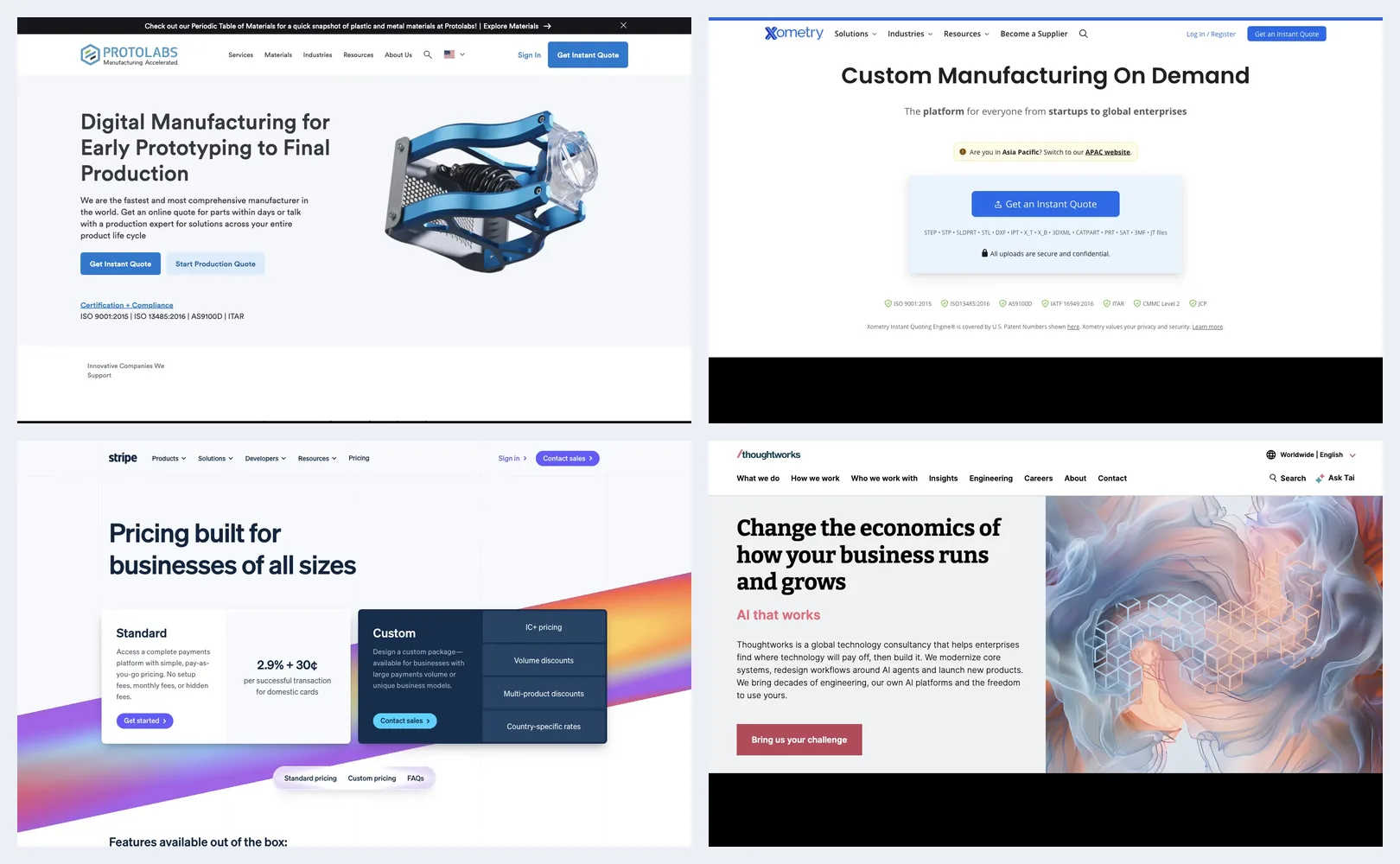
What to avoid, from the same captures: chat that opens over a pricing table, proof rows that load after the screenshot (or the visitor) has moved on, consent banners with only one choice, and headlines that name a category instead of a job. If you're deciding how many pages these patterns need, our guide to landing pages vs websites has a decision table, and our website architecture guide shows how to give each buyer task its own page. Once a buyer clicks through to learn who you are, our about us page examples show how to back that page with checkable facts.
A scoring sheet for your own site
Copy this table and open your homepage and your pricing or contact page. Score the first five rows and the Mobile row 0, 1 or 2 using the rubric above. The repeat-buyer, interruption and speed rows are extra checks: note what you find. Do it with a colleague who didn't build the site.
| Check | Question to answer in under 10 seconds | Your score (0–2) | Example to compare against |
|---|---|---|---|
| Value proposition | Can a stranger say what you sell and to whom from the first screen? | Protolabs | |
| Proof | Is there one checkable proof point within one scroll of the main button? | Xometry | |
| Buyer paths | If you have two kinds of buyer, does each see its own door? | Gusto, Toptal | |
| Pricing | Can a buyer estimate their cost, or start a quote, without talking to sales? | Gusto, Stripe | |
| Demo/contact | Are self-serve and sales paths both visible, with a short form? | Vercel | |
| Repeat buyers | Can an existing customer reorder or reach support from the header? | Uline, McMaster-Carr | |
| Interruptions | Does anything (chat, promo, consent) cover prices or the main button? | HubSpot (what to avoid) | |
| Mobile | Do the main button and the proof still appear in the first mobile screen? | Stripe, Vercel | |
| Speed | What does PageSpeed Insights (mobile) report? Run it two or three times. | Compare with your own earlier runs, not with other sites |
Any row scoring 0 is your first fix. Two or more 1s on the same page can mean the page is trying to serve too many buyers at once. That's a sign to consider splitting it into separate pages.
Where PolyDraft fits
PolyDraft is one way to build the kind of multi-page B2B site the two disclosed examples show. We make it, so weigh this section accordingly.
PolyDraft builds an Astro website from a brief or an existing site, and the finished site deploys to your own Cloudflare account under your own domain (features). Its built-in admin includes a blog, an inquiry inbox that records each lead's country of origin, and an image library (features). That can suit export manufacturers and service firms with buyers in several countries. Multilingual sites get hreflang annotations, with up to 10, 30 or 100 languages per site depending on plan (pricing, checked 18 Nov 2026). Our page for global brands and exporters explains that approach. Building and previewing are free, a subscription is needed to publish, Starter costs $39 a month, and access is currently invite-based (pricing, checked 18 Nov 2026).
Know the limits. PolyDraft has no online store or B2B ordering cart, so a catalog business like McMaster-Carr or Uline belongs on a commerce platform. It has no A/B testing and no redirect manager. It doesn't build instant-quote engines like Xometry's. If you're comparing builders for this job, our checklist for evaluating an AI website builder lists questions to ask any vendor, including us. If you'd rather have the site built for you, see AI FDE, our done-for-you service.
How we tested
- Dates: desktop pages on 18 and 19 November 2026; phone screens and PageSpeed Insights runs on 19 November 2026.
- Task: For each of the 12 third-party sites, capture the homepage hero and the one section worth copying, capture the homepage at phone size, run PageSpeed Insights on the homepage, then score everything against the six-criterion rubric above.
- Setup: Desktop Chrome at a 1440 × 900 viewport, then the same browser at a 390 × 844 viewport for phone screens. No sign-in on any site, no forms submitted. Our browser showed visitors as being in East Asia, which affects cookie banners, region prompts, redirects and possibly displayed prices. We cropped a browser extension bar from the top of each capture where one appeared, and cropped cookie banners from desktop section captures. On phone captures the bar hid the top strip of 10 of the 12 pages (all but Stripe and Gusto). Phone captures keep their banners, because they are part of the first screen. We blurred one form field pre-filled from our location (Vercel).
- Speed: PageSpeed Insights at pagespeed.web.dev, mobile, one run per homepage on 19 November 2026 (Lighthouse 13.6.0, emulated Moto G Power, slow 4G). The public PageSpeed API returned "Quota exceeded" on 18 and 19 November, so we used the web page. Lab scores vary from run to run, often by several points, because of server load, network and ads or tests running on the page. The field data comes from the Chrome UX Report and covers the previous 28 days of real Chrome users.
- What we captured: Desktop pages for all 12 third-party sites, a phone screen for each, and one PageSpeed Insights report. The hero image combines four of the 18 November screenshots. Two captures failed after repeated attempts: Linear's desktop hero stayed blank and the Faire section below the hero didn't load. Twilio and Grainger were dropped: Twilio's pages were covered by a consent dialog in both captures, and Grainger didn't load.
- What we didn't test: Sign-ups, demos, quotes and checkout flows on any site. Phone layouts below the first screen. Repeated speed runs. The two PolyDraft-built sites.
- Prices: Copied from each vendor's own page on 18 November 2026, except the McMaster-Carr part price, checked 19 November. They are the prices shown to our session and can differ by region. They change often, especially promotions like HubSpot's.
- Conflict of interest: We make PolyDraft. Two of the 14 entries were built with it by PolyDraft customers. We anonymised them as our earlier article did, didn't score them in the rubric table, and listed their weak spots. PolyDraft itself doesn't appear in the scored table. No third-party site paid for or was told about its inclusion. We have no affiliate relationship with any company mentioned (editorial policy).
Frequently asked questions
What makes a B2B website good?
A good B2B website says what it sells and to whom in the first screen, puts checkable proof next to the main button, gives each type of buyer its own path, shows a price or an instant quote where possible, and keeps sales forms short. Among the best B2B websites in our set, Protolabs and Xometry did the first four on the desktop homepage. We didn't test their forms.
Should a B2B website show prices?
Show prices when most buyers can self-serve, as Gusto, Linear and Stripe do, and say clearly where custom pricing starts. When every job is different, an instant quote can do the same job, as Protolabs and Xometry offer. Consultancies such as Thoughtworks show no prices on the homepage. They need stronger proof and a clear contact step instead.
How many calls to action should a B2B homepage have?
Usually one per buyer type, rarely more than two. Protolabs splits by buying stage (instant quote vs production quote), and Vercel splits by buyer (deploy now vs talk to sales). More than two buttons in the hero usually means the page is serving too many audiences. This is our recommendation from the 12 sites, not a rule.
Where should proof go on a B2B website?
Within one scroll of the main button, and in a form the buyer can check: certifications, named customers, sample deliverables or specific results. Protolabs lists its ISO and AS9100D certifications directly under its quote buttons. Proof that loads late or sits at the bottom of the page is easier to miss.
Are B2B websites different from small-business websites?
They share the basics, such as a clear offer and one main action. B2B sites usually also need separate paths for several buyers, pricing or quoting for considered purchases, and proof that holds up with procurement. Our business website examples cover the local small-business side.
Sources
- Stripe: Homepage, checked 19 Nov 2026 (from our screenshot), and Pricing, checked 18 Nov 2026
- Linear: Pricing, checked 18 Nov 2026, and Homepage, phone capture 19 Nov 2026
- HubSpot: Homepage, checked 19 Nov 2026 (from our screenshot), and Marketing Hub pricing, checked 18 Nov 2026
- Gusto: Homepage, checked 19 Nov 2026, and Pricing, checked 18 Nov 2026 (both from our screenshots)
- Vercel: Homepage and Contact sales, checked 18 Nov 2026
- McMaster-Carr: Homepage, checked 18 Nov 2026, and part 91251A540, checked 19 Nov 2026
- Protolabs: Homepage, checked 18 and 19 Nov 2026
- Uline: Homepage, checked 19 Nov 2026, and Shipping and Handling Labels, checked 18 Nov 2026
- Xometry: Homepage, checked 18 and 19 Nov 2026
- Faire: Homepage, checked 18 Nov 2026
- Toptal: Homepage, checked 18 and 19 Nov 2026 (from our screenshots)
- Thoughtworks: Homepage, checked 18 and 19 Nov 2026
- Speed: PageSpeed Insights, mobile, run 19 Nov 2026, and Google's About PageSpeed Insights
- PolyDraft: Features, Pricing, Editorial policy, checked 18 Nov 2026
About this article. Drafted by an AI agent following PolyDraft's blog workflow and reviewed by Vincent Chen. Screenshots were captured on 18 and 19 November 2026 in Chrome at desktop and phone sizes, then cropped, with an extension bar removed, cookie banners removed from desktop section captures and one location-filled field blurred. Claims quoted from the example sites, such as certifications, customer counts and outcome figures, are those sites' own. We didn't verify them or measure any site's traffic. The hero image combines four of the screenshots in this article.